Archives for January 2011

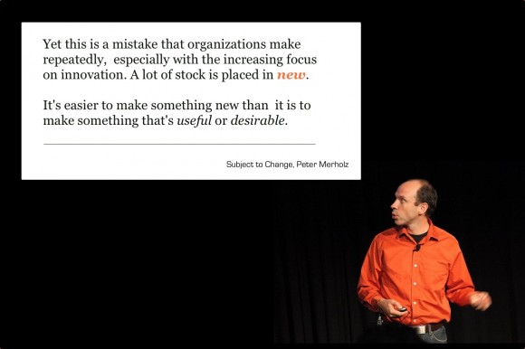
Cytat dnia – Peter Merholz

"Yet this is a mistake that organizations make repeatedly, especially with the increasing focus on innovation. A lot of stock is placed in "new." It's easier to make something new than it is to make something that's useful or desirable."

Źródło: Subject to Change: Creating Great Products & Services for an Uncertain World: Adaptive Path on Design, Peter Merholz, Todd Wilkens, Brandon Schauer, David Verba
Autor zdjęcia: Robert Drózd
Krótki research – Natural User Interface

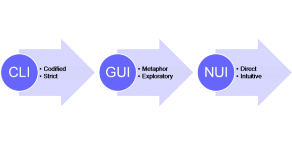
Wraz z pojawieniem się Microsoft Kinect, po raz kolejny na horyzoncie pojawił się termin Natural User Interface. Ten termin (jak większość związanych z Human-Computer Interaction oczywiście niedoprecyzowany :) pojawił się w okolicach roku 2006, po prezentacji Jeffa Hana (widoczna poniżej).

NUI Group (rodzaj W3C dla naturalnych interfejsów) definiuje Natural user interface jako:

Natural user interface, or NUI, is an emerging paradigm shift in man machine interaction of computer interfaces to refer to a user interface that is effectively invisible, or becomes invisible with successive learned interactions, to its users. The word natural is used because most computer interfaces use artificial control devices whose operation has to be learned. A NUI relies on a user being able to carry out relatively natural motions, movements or gestures that they quickly discover control the computer application or manipulate the on-screen content.

Focuses on traditional human abilities such as touch, vision, speech, handwriting, motion and more importantly higher level processes such as cognition, creativity and exploration. Through its study to replicate real world environments and thus situations utilizing emerging technological abilities and sensing solutions which will allow for more accurate and optimized interaction between physical and digital objects.

Prawda, że przejrzysta definicja? Wg mnie, dużo lepsza definicja NUI znajduje się Wikipedii:

Natural user interface, or NUI, is the common parlance used by designers and developers of computer interfaces to refer to a user interface  that is effectively invisible, or becomes invisible with successive learned interactions, to its users. The word natural is used because most computer interfaces use artificial control devices whose operation has to be learned. A NUI relies on a user being able to quickly transition from novice to expert.

While the interface requires learning, that learning is eased through design which gives the user the feeling that they are instantly and continuously successful. This can be aided by technology which allows users to carry out relatively natural motions, movements or gestures that they quickly discover control the computer application or manipulate the on-screen content. A common misunderstanding of the “Natural User Interface” is that it is somehow mimicry of nature or that some inputs to a computer are somehow more ‘natural’ than others. In truth, the goal is to make the user feel like a natural.


Innymi słowy, NUI jest rodzajem (nieco akademickiej) warstwy abstrakcji dla rozmaitych interfejsów, jak Kinect czy multi-touchowe telefony lub tablety. Fajnie.

W wątku What are the basic principles of NUI (natural user interface) design? na coraz bardziej interesującej (i kosztownej czasowo) Quorze, znalazłem trochę interesujących rekomendacji, związanych z projektowaniem NUI.

Dan Saffer, autor Designing Gestural Interfaces: Touchscreens and Interactive Devices i bardzo znanego Desiging for Interaction:

  • Design for Fingers, not Cursors. Touch targets need to be much larger than for desktop: 8-10mm for tips, 10-14mm for finger pads.
  • Remember physiology and kinesiology. Don’t make users do overextensions or repetitive tasks.
  • No gorilla arm. Humans weren’t meant to do many tasks with hands up in front of their bodies for long periods of time. Sorry Minority Report.
  • Screen coverage. Fingers are attached to a palm, which can cover the screen while you are trying to do a gesture. Avoid putting essential elements like labels below a control, as it can be obscured by the user’s own hand. Place items like menus at the bottom of the screen to avoid this phenomenon.
  • Know the technology. The kind of touchscreen, sensor or camera determines the kind of gestures you can design for.
  • The more challenging the gesture, the fewer people who will be able to (or want to) perform it.
  • Trigger actions on release, not on press.
  • Attraction affordance. Use a simple gesture to get users to start using the system.
  • Avoid unintentional triggers. A variety of everyday movements on the user’s part can accidentally trigger the system. Avoid.
  • Gestures and Command Keys. Provide an easy (buttons, sliders, menu items, etc.) ways to access functionality, but provide advanced, learnable gestures as shortcuts.
  • Requisite variety. There’s a wide range of ways to perform any gesture. Account for that.
  • Match the complexity of the gesture to the complexity and frequency of the task. Simple, frequently used tasks should have equally simple gestures to trigger them.

Ciekawy jest też komentarz Rachela Hinmana, naukowca/Mobile UX Research Scientist z  Nokia Lab:

Principle of Performance Aesthetics
Unlike GUI experiences that focus on and privilege accomplishment and task completion, NUI experiences focus on the joy of doing. NUI experiences should be like an ocean voyage, the pleasure comes from the interaction, not the accomplishment.

Principle of Direct Manipulation
Unlike GUI interfaces, which are enabled by indirect manipulation through a keyboard and mouse, natural user interfaces enable users to interact directly with information objects. Touch screens and gestural interaction functionality enable users to feel like they are physically touching and manipulating information with their fingertips. Instead of what you see is what you get, successful NUI interfaces embody the principle of what you do is what you get.

Principle of Scaffolding
Successful natural user interfaces feel intuitive and joyful to use. Information objects in a NUI behave in a manner that users intuitively expect. Unlike a successful GUI in which many options and commands are presented all at once and depicted with very subtle hierarchy and visual emphasis, a successful NUI contains fewer options with interaction scaffolding. Scaffolding is strong cue or guide that sets a user’s expectation by giving them an indication of how the interaction will unfold. Good NUIs supports users as they engage with the system and unfold or reveal themselves through actions in a natural.

Principle of Contextual Environments
One of the great things about natural user interfaces is that they are dynamic and can locate themselves in space and time. Unlike GUIs that will present a user with the same set of options regardless of the context it is in, NUIs are responsive to the environment and suggests what the next interaction should be. (example google maps on an iphone)

Principle of the Super Real
Unlike GUIs that contain information in a cascading series of windows that resemble sheets of paper, successful NUIs extend objects in a logical way into the world of magic. With features like stretch to zoom, the UI elements of NUIs not only look real, we perceive them to be super real as their character can change in a way that is almost magical.

Principle of Social Interaction
Unlike GUIs that are highly visual and often require a great deal of cognitive focus to use, NUIs are simpler and require less cognitive investment. Instead of getting lost in a labyrinth of menu options, menus on NUIs are streamlined, enabling more opportunities for users to engage and interact with other users instead of the system’s interface. Unlike GUI laptops that are optimized for individual use, systems with larger NUI formats like the Microsoft Surface Table or tablets, like the iPad, lend themselves to social computing experiences.

Principle of Spatial Representation
Unlike GUI systems, where an icon serves as visual representation of information, NUIs represent information as objects. In the world of successful natural user interfaces, a portion of an object often stands for the object itself. NUI objects are intelligent and have auras.

Principle of Seamlessness
GUIs require a keyboard and mouse for interaction with a computing systems. Touchscreens, sensors embedded in hardware, and the use of gesturral UIs allow NUI interactions to feel seamless for users because interactions are direct. There are fewer barriers between the user and information.

Podsumowując: Bardzo interesujący, bardzo rozwojowy temat. W zasadzie kompletnie nowa dziedzina do zbadania, zdefiniowania heurystyk i nowych świętych wojen, które już zaczynają się toczyć.

Bardzo dziękuję jedynemu Polakowi zaangażowanemu w NUI Group – Pawłowi Sołydze za pomoc w zgłębieniu tematu. Paweł, weteran Google Summer of Code, uczestniczył m.in. w tworzeniu touchlib, CCV (Community Core Vision) i OpenTouch pod Mac OS X.

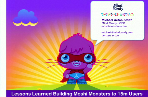
Prezentacja – Lesson Learned building Moshi Monsters

Interesująca prezentacja, w jaki sposób stworzyć, zaprojektować i utrzymać serwis społecznościowy dla grupy wiekowej 7-12.

Gdybym miał ją w jakiś sposób sklasyfikować, to chyba terminem który opisywałby ją najlepiej byłby product development. Znajdziecie w niej  trochę informacji o projektowaniu gier dla dzieci, reklamowaniu produktów i wykorzystaniu modelu Freemium do zarabiania pieniędzy.

Co ciekawe, przy projektowaniu produktów Moshi Monster przetestowało i wykorzystało znany case tygodnika Economist opisany m.in. przez Dana Ariely w książce Predictably Irrational (model trzech cen i odrzucania skrajnie niekorzystego rozwiązania).

Warte obejrzenia.

Wyrwane z kontekstu – Why is Dropbox more popular than other tools with similar functionality?

In the end, it really came down to one incredibly genius idea: Dropbox limited its feature set on purpose. It had one folder and that folder always synced without any issues — it was magic. Syncplicity could sync every folder on your computer until you hit our quota. (..) Our company had too many features and this created confusion amongst our customer base. This in turn led to enough customer support issues that we couldn’t innovate on the product, we were too busy fixing things.

After I left Syncplicity, I ran into the CEO of Dropbox and asked him my burning question: “Why don’t you support multi-folder synchronization?” His answer was classic Dropbox. They built multi-folder support early on and did limited beta testing with it, but they couldn’t get the UI right. It confused people and created too many questions. It was too hard for the average consumer to setup. So it got shelved.

If you’re starting a new company, the best thing you can do is keep your feature set small and focused. Do one thing as best as you possibly can. Your users will beg and beg for more functionality. They will tell you their problems and ask you to fix it. My philosophy is that they’re right if their feature request is right only if it works for 80% of your customers.

Źródło: Why is Dropbox more popular than other tools with similar functionality? – Quora, Isaac Haal, co-founder of Syncplicity (bezpośredniej konkurencji Dropboksa)

Wyrwane z kontekstu – We manage what we can EASILY measure

Measurement is essential. But what is even more important is what you measure. Theres no point in measuring the wrong thing. Unfortunately, that is often what happens when it comes to web management. The philosophy often seems to be: lets find whats easy to measure and then lets manage that.

Take for example the Cult of Volume that pervades so much management thinking when it comes to the Web. Its long been known that HITS stands for How Idiots Track Success. But people still love to quote HITS because HITS is an easily calculable, big number and we all know how everyone just loves BIG numbers.

HITS is a totally and utterly useless metric. For the vast majority of websites, volume-based metrics are useless, counter-productive and encourage the worst possible practice when it comes to web management.

Źródło: We manage what we can EASILY measure, Gerry McGovern,

Little Big Details – Zbiór zgrabnych detali w interfejsach

Little Big Details to przyjemny serwis zbierający przykłady eleganckich, zgrabnych detali poprawiających użyteczność róznych interfejsów – zarówno webowych jak i  desktopowych. Idealne do porannej kawy. Polecam.

Przykład – Analiza heurystyczna aplikacji na iPhone-a

Przeglądając kilka dni temu RSS-y natknąłem się na przykład dość mało rozbudowanej analizy heurystycznej  aplikacji na iPhone’a – Evaluation of an in-development iPhone App. Jako że materiałów porównawczych nigdy dość – warto przejrzeć wpis ramach ciekawostki – choć niekoniecznie aby czerpać z niego wiele inspiracji :)

Wyrwane z kontekstu – Intranet user research

One key reason to do a lot of interviews for an intranet redesign is… political. Although it might not seem like it, these interviews pave the way for user acceptance. The more people you interview now, the more people you have who are primed to be positive about your redesign. Don’t forget to talk to managers and executives, too.

Źródło: lista IAI Members, Dana Chisnell, współautorka znakomitej książki Handbook of Usability Testing

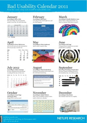
Wreszcie! Bad Usability Calendar 2011!

Jak co roku (w tym roku po raz siódmy!) na początku stycznia został wydany kalendarz Bad Usability Calendar. W tym roku widać wyraźną inspirację Stevem Jobsem (Apple), Markiem  Zuckerbergiem i Danem Roamem (tym od idei rysowania pomysłów na kartkach).

Coż więcej dodać? Ściągajcie, drukujcie i propagujcie… Jak co roku :)

Pobierz kalendarz na rok 2011 lub przejrzyj kalendarze z ubiegłych lat.

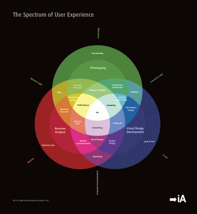
Grafika – Spectrum of User Experience

Author information archictects, source: http://www.informationarchitects.jp
Źródło: The Spectrum of User Experience – Flickr, Autor: IA (informationarchitects.jp)

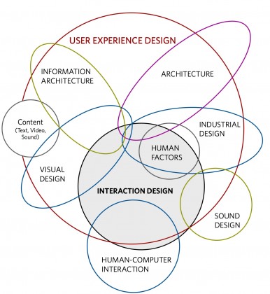
Grafika – User Experience design

Autor: Dan Saffer

Link – No One Nos: Learning to Say No to Bad Ideas

As a user experience designer, I have made a career out of having to say No. It is my job to put an end to bad design practices within an organization before I can make any progress on improving the lives of our customers. And it’s rarely easy.

Na popularnym serwisie dla designerów A List Apart ukazał się jakiś czas temu artykuł  No One Nos: Learning to Say No to Bad Ideas o sensie słowa NIE w procesie projektowania. Mimo, że miałbym problem z nazwaniem tego tekstu epokowym i w po części odsyła on ksiązki Siła pozytywnego “NIE” – warto go przejrzeć i przemyśleć. Polecam ;)