Archives for October 2010

Wyrwane z kontekstu – Usability for Handheld Devices Versus Computers

The first big question to ask is, Do users need one hand or two hands to operate a device? Interacting with Web sites on a computer normally requires the use of two hands when typing on a standard keyboard and one hand when using a mouse or other pointing device. With the vast diversity of handheld devices, users often need to decide whether to use a particular device with both hands or only one hand. Sometimes this decision is contextually constrained.
For example, people driving a vehicle have only one hand free when operating a GPS device. Sometimes this decision is culturally constrained. For example, smartphone users in Japan are accustomed to using their smartphones with one hand, because they’re often using their other hand to hold onto a handrail on a running train.

Whether we intend a device for one-hand or two-hand use can greatly impact how we design it – and, therefore, affect how people perceive its usability. Usability professionals should take this factor into consideration when planning test tasks and creating test scenarios.

Źródło: Usability for Handheld Devices Versus Computers, Shanshan Ma, UXmatters.
Wyrwane z kontekstu – Online Banking: Why People Are Branching Out

Clear and simple terminology was rated as a very important design element for banking sites. Failure to achieve this can dissuade potential banking customers. A usability study of an online banking site by SURL found users to be confused by the term “Payee” (i.e., users wondered “Is that me or the company I am paying?”). As a result, it is recommended to use more meaningful terminology when setting up an individual or company. For example, “Account number for whom you are paying:” may be more meaningful than “Payee account”.


Results from this study showed that “feedback on acceptance or rejection of information”, “indicating a function has been completed”, and “identifying/fixing mistakes” were rated as very important design features for a banking site. Including these features may avoid confusion related to online forms in the transaction process. Other design recommendations for forms include clearly indicating required fields, placing legible error messages in a highly visible area, and providing feedback on how to proceed when completing a transaction.

Frequency Percent
The bank offered online banking 10 26
Their website contained the information I was looking for 7 18
I liked the functionality the banking site offered 6 15
Their website was easy to use 4 10
I liked the way the site looked 1 3
None of the above 27 69

Table: Factors influencing participants choosing a bank

Źródło: Usability News 62 – Bayles.

Powiązany artykuł: Banki w „komórkach” czyli badania w Korei

Prezentacja – The Impact of Brand User Experience Design

Prezentacja – “The Impact of User Experience Documentation – creative processes used to develop effective guidelines for brand communication and user experience design. From a brand perspective”. Polecam. Dobre, realne przykłady.

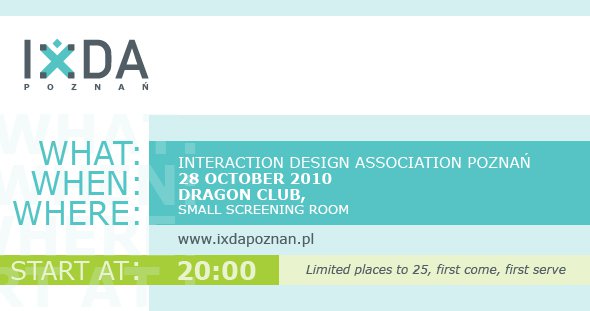
IxDA Poznań – Spotkanie 28.10.2010

Już w najbliższy czwartek, 28 października 2010 roku, w Poznaniu odbędzie się drugie spotkanie lokalnego (jedynego w Polsce?) oddziału Interaction Design Association – IxDA Poznań. Spotkanie rozpocznie się o godzinie 20 w klubie Dragon.

Według informacji na stronie spotkania na Facebooku wystąpią:

1. Darko Bosiljcic: Intro
2. Mariusz Dziechciaronek: Czym jest Interaction Design?
3. Marcin Chłodnicki: Service Design – Interface, Interaction, Experience
4. Kuba Zwoliński: Magento Commerce – open source w profesjonalnym e-handlu
5. Radosław Śmigasiewicz: Tangible Interaction
6. Bartosz Mozyrko: New UX Trend – Content Strategy
7. Ines Porowska: Designing multimedia learning objects for mobiles
8. Bartek Rycharsk: Nauczyciele z kamerami są bohaterami (i milionerami), czyli o tym jak Open Video Learning zmienia edukację

Wyrwane z kontekstu – How Google tested Google Instant

The team was struck by how few of the outsiders noticed that the search results were changing rapidly below the search bar, Boyd said. People in this testing protocol noticed other changes that Google had recently made–such as the design changes on the left-hand navigation bar that had rolled out several months before most were brought into the testing lab–but less than half of the outsiders noticed Google Instant during the first series of tasks.

As the summer progressed, researchers settled into a weekly pattern. They would test Google employees the first few days, and outsiders later in the week, meeting with the Google Psychic design team when testing was complete to go over the results and suggest changes. One major change that was the direct result of user feedback was the rate at which Google Instant generated new results, which was too fast for early testers of the product.

The end result was what Boyd called “the most positive professional experience of my research career,” with Google Instant rolling out in early September with few glitches or complaints.

Źródło: How Google tested Google Instant, Cnet

PS. To już setny wpis. Dzięki.

Pytanie – W jaki sposób zbadać skuteczność pracy specjalisty ds. użyteczności na etacie?

W polskich serwisach “pracowych” powoli zaczynają pojawiać się propozycje dla specjalistów ds. użyteczności (zwykle bez dookreślenia, jakie mają być główne zadania i rola takiego specjalisty). W moim odczuciu można zauważyć dwie główne grupy pracodawców:

  • software house/portale webowe nastawione na długie projekty, tworzące jeden/dwa produkty
  • agencje interaktywne i webowe realizujące wiele projektów jednocześnie

Bardziej niż miejsce w którym ma się znajdować dział użyteczności (więcej na blogu Adama Plony we wpisie Rola projektantów w strukturze korporacji) interesujące jest, w jaki sposób można mierzyć i oceniać zatrudnionego specjalisty do spraw użyteczności. Ciężko jest znaleźć jakąś miarę, a jeśli nawet uda się ją zastosować, to jest ona niepełna. No bo co oceniać?
Ilości wyprodukowanych prototypów? Gradienty na mockupach?  Elegancję architektury informacji? Wyniki badań (mówiące że wszystko jest do poprawy :)? Zadowolenie klienta?

[Read more…]

User Exprerience w Microsoft – jak oni to robią?

Mniej więcej rok temu, na blogu Microsoftu poświęconego nowej wersji Office, pojawił się wpis o tym jak Microsoft bada z użytkownikami nowego Office’a, we wczesnym stadium produkcji.

We bring people from outside of Microsoft into a small room (a.k.a., the lab) that contains a desk and a PC so they can work with our software. Inside the lab, there are some cameras and a piece of one-way glass so the researcher, the designers, PMs, testers and developers can all monitor whether or not the software being studied is meeting the needs of the user. We conduct these lab studies in order to find problems that affect the usability of our software and we typically do a few thousand hours of these studies for each release of Office.

One of our favorite pieces of equipment to use in the lab is the eye tracker. The eye tracker allows us to see what people are looking at while they are using our software. This is incredibly useful when building new UI like the Ribbon and the Backstage because the mouse pointer doesn’t always tell an accurate story about where people are looking on the screen. Below is an example of output (a heat map on the left and gaze plot on the right) from one of our eye tracking studies conducted on the Backstage view using an early prototype.

clip_image002 clip_image003

The heat map on the left tells us where people spent most of their time looking for something. The longer someone looks at a specific location, or the more times someone’s gaze returns to a specific location, the hotter the color on the heat map. The gaze plot on the right tells us the path the eyes followed to get to a particular location.

The study participants’ goal was to open a recently used file. To complete the task successfully, a participant needed to open a specific file – the third in the Most Recently Used (MRU) list shown in the middle pane (of the 3 panes displayed on the screen). All participants were successful on this task. What we learned from the pictures above, however, was that while people eventually located the correct file, they spent a lot of time searching through the templates section in the right pane before going to the MRU.

Co ciekawe z innej notatki wynika, że Microsoft korzysta w sensowny sposób z prototypowania i szkicowania, a także prowadzi badania terenowe (field studies):

We identify user needs and create compelling experiences in a number of ways. For example, User Experience Researchers work to understand user needs early in the product development cycle using methods such as Field Visits. A field visit is when Researchers visit with users in their own environment and observe how they work with software to get their tasks done. Researchers also utilize methods such as Lab Studies (see image below) where we bring users into controlled lab environments and have them work through real world scenarios. While doing so, we use prototypes as primitive as paper drawings to actual working builds; depending on the phase we are at in the product development cycle.

W powszechnym postrzeganiu Microsoft nadal jest identyfikowany jako ociężała firma, która tworzy niezrozumiałe i trudne w użyciu produkty. Powyższe cytaty dają nadzieję, że kolejne wersje aplikacji wypuszczanych przez firmę z Redmond będą powodowały mniej frustracji i niezadowolenia użytkowników. Oby ;)

Źródła:

Video – The Myth of Usability Testing

Robert Hoekman, Jr. | The Myth of Usability Testing from PechaKucha PHX on Vimeo.

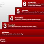
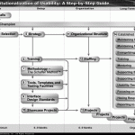
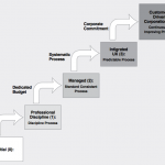
Galeria – UX Company Strategy

Źrodła:

Planning your UX Strategy, Johnny Holland

Institutionalization of Usability: A Step-by-Step Guide, Eric Schaffer

Corporate User-Experience Maturity Model, Sean Van Tyne

Wyrwane z kontekstu – Engaging Experience: A New Perspective of User Experience with Physical Product

W ramach konferencji Human Centered Design 2009 opublikowany został ciekawy, przeglądowy artykuł “Engaging Experience: A New Perspective of User Experience with Physical Products”  autorstwa Chun-Juei Chou oraz Chrisa Conleya. Poniżej kilka fragmentów. Polecam również cały artykuł :)

[Read more…]

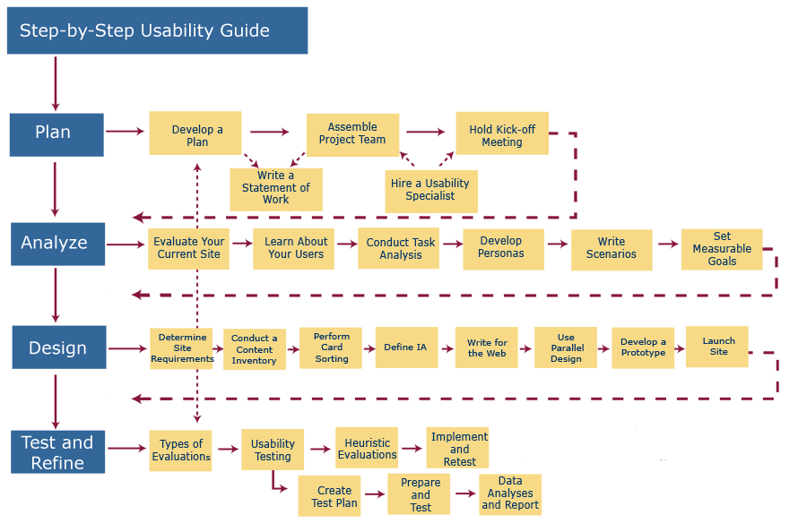
Obrazek – Step by Step Usability Guide

Źródło:Usability.gov – Visual Map.

World Usability Day 2010 – Wrocław, Gliwice, Warszawa

Ostatnia aktualizacja wpisu: 08 listopada 2010

Wygląda na to, że World Usability Day 2010 w tym roku odbędzie się w Polsce w trzech miejscach – we Wrocławiu, Gliwicach i Warszawie.

1. Spotkanie we Wrocławiu już za nami.

2. Spotkanie w Gliwicach 9 listopada 2010 r.

3. Spotkanie w Warszawie 16 listopada 2010 r.