Archives for September 2010

Wyrwane z kontekstu – Top Ten Misconceptions about Eye Tracking

W najświeższym numerze UX (User Experience) bardzo dobry artykuł “More than Just Eye Candy – Top Ten Misconceptions about Eye Tracking” (dostęp ograniczony) autorstwa Agnieszki Bojko i Kristin Adamczyk, poświęcony demistyfikacji najpopularniejszych wierzeń związanych z eye trackingiem.

#1 – All usability research can benefit from eye tracking.

One common belief is that any usability study will provide better insight if accompanied by eye tracking. However, a simple cost-benefit analysis of the insight gained versus the amount of additional time and resources that eye tracking requires will show that eye track- ing is not always appropriate.

In formative usability testing, the ratio of insight to cost for eye tracking is very small; most usability issues can be uncovered with traditional usability research. For example, if a study goal is to improve the overall user experience on a new website or to make instructions for a medical device easier to understand, eye tracking may be of little value.

However, eye tracking will benefit studies that aim to answer specific questions that arose from previous testing (for example, Why are users struggling to find drug storage instructions on a package insert?). Eye tracking can also be useful in summative testing as it provides additional measures to help quantify the user experience.

Polecam cały artykuł. Zdecydowanie warto.
Magia numerów: 95 znaków wystarczy każdemu?

Nie bardzo wierzę w magię cyfr, prostych rozwiązań i badań dających odpowiedź na wszystkie pytania. Pomimo tego niektóre badania, przeprowadzone ze znamionami doświadczalności, mogą dać próbę odpowiedzi na konkretne pytania, w konkretnym miejscu w czasie.

Do tego typu badań, należy badanie z 2005 rok – “The Effects of Line Length on Reading Online News”, mające dać odpowiedzieć, jaka ilość znaków w linii (na stronie WWW) jest najwłaściwsza.

Reading rates were found to be fastest at 95 cpl (characters per line) . Readers reported either liking or disliking the extreme line lengths (35 cpl, 95 cpl). Those that liked the 35 cpl indicated that the short line length facilitated “faster” reading and was easier because it required less eye movement. Those that liked the 95 cpl stated that they liked having more information on a page at one time. Although some participants reported that they felt like they were reading faster at 35 cpl, this condition actually resulted in the slowest reading speed.

Circulation of newspapers at 814 of America’s largest daily newspapers declined 1.9% from September 2004 to March 2005 (Shin, 2005). This decline is part of a 20-year trend in newspaper circulation and is due, in part, to the increased use of the Internet and other forms of media (cable, satellite, etc). As users continue to choose online news sources, it is imperative to understand factors that contribute to improving the overall online reading experience for news. Participants were able to read news articles significantly faster while maintaining high reading efficiency using 95 cpl. Despite the fact that there were no differences in satisfaction scores, a line length that supports faster reading could impact the overall experience for users of online news sources.

Źródło: Usability News 72 – The Effects of Line Length on Reading Online News

Wyrwane z kontekstu – Why Everything You Think about User-Centred Design is Wrong

Thomas Petersen, autor bloga Black&White™, niemal rok temu temu  napisał fascynujący artykuł, reprezentujący krytyczne podejście do niektórych aspektów wykorzystania filozofii User-Centred Design, zwłaszcza testowania i przykładaniana dmiernego znaczenia, do testowania i badania wireframe-ów i prototypów, zamiast istniejących produktów.

Putting users into the process after research and before the final product is finished provides primarily pseudo value. It confuses users with customers, and is responsible for valuable time being wasted in a pseudo environment tackling pseudo problems that have no bearing on those you may find yourself with after the launch.

However, at that point it’s too late, since applied UCD normally leaves the building right before the implementation starts, and where the product really starts to take shape.

This is where UCD really fails.

What is required to create good products is not the ability to test your idea or the usability with users. What is necessary is testing the finished product with customers and improving it from there. This requires a different approach to thinking, and a different set of skills.

Testing users is about testing the current state of usability and intuition. This belongs to the type of research that people like J.Nilesen, J.Spool and others perform so well. It contains a lot of valuable knowledge and should be the foundation for anyone wanting to do UCD.

But testing customers means getting the product in their hands, and learning how it behaves; to pinpoint problem areas and then figure out ways to improve it. It allows you to test the actual problems instead of a number of pseudo problems that may never arise.

Bardzo ciekawa i zaskakująco merytoryczna :) dyskusja na ten temat odbyła się też  w wątku “Sensowna krytyka UCD – polecam” na GoldenLine. Polecam.

Źródło: Black&White™ » Blog Archive » Getting to the Customer – Why Everything You Think about User-Centred Design is Wrong

Koncepcja zbadania łatwości zapamiętania nazwy serwisu

Q: We think our client’s proposed name for their application is hard to remember. How do we prove it? Looking for a simple testing protocol or article on same… any suggestions most welcome, thanks!

For detail: their proposed name is both a new verb form based on an adjective (eg “surprisify”) /and/ a spelling variant of what you’d expect the spelling to be (eg “surprizify”) (those aren’t the real words, but it gives you an idea.

A: Try using a five-second test, and put up a mockup/slide of a home page with several bullet points. Take it down after 10-15 seconds. You could even have audio pronouncing the hard to register (and perhaps not phonetically spelled) name.

After the test, ask people what they remember from the site. Then ask them to go to the web site’s address, and watch what they type. As always, reassure them there’s no right answer, and that they aren’t being tested (especially because you’re hoping they will fail).

Źródło: Protocol for testing domain/brand recall, Archiwum IxDA

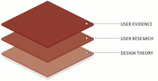
Obrazek – Validation Stack

Źródło: Winning a User Experience Debate | UX Booth.

Wyrwane z kontekstu – Five UX Research Pitfalls – Users give you conflicting feedback

You are running a usability study and evaluating whether users prefer to delete album pictures using a delete keystroke, a remove button, a drag-to-trash gesture, or a right-click context menu. After testing a dozen participants, your results are split among all four potential solutions. Maybe you should just recommend implementing all of them?


It’s unrealistic to expect users to understand the full context of our design decisions. A user might suggest adding “Apply” and “Save” buttons to a font preference dialog. However, you might know that an instant-effect dialog where the settings are applied immediately without clicking a button or dismissing the dialog makes for an easier, more effective user experience. With user research, it’s temptingly easy to create surveys or design our experiments so study participants simply vote on what they perceive as the right solution. However, the user is giving you data, not an expert opinion. If you take user feedback at face value, you typically end up with a split vote and little data to make an informed decision.


  • Ask why. Asking users for their preference is not nearly as informative as asking users why they have a preference. Perhaps they are basing their opinion upon a real-world situation that you don’t think is applicable to the majority of your users (e.g., “I like this new mouse preference option because I live next to a train track and my mouse shakes and wakes up my screen saver”).
  • Develop your organization’s sense of UI values. Know which UI paradigms (e.g. Mac vs. Windows, Web vs. desktop, etc) and UI values (e.g. strong defaults or lots of customization, transparency or progressive disclosure) your team values. When you need to decipher conflicting data, you’ll have this list for guidance.
  • Make a judgment call. It’s not often helpful to users to have multiple forms of the same UI. In most cases it adds ambiguity or compensates for a poorly designed UI. When the user feedback is conflicting, you have to make a judgment call based upon what you know about the product and what you think makes sense for the user. Only in rare cases will all users have the same feedback or opinion in a research study. Making intelligent recommendations based upon conflicting data is what you are paid to do.
  • Don’t aim for the middle ground. If you have a legitimate case for building multiple implementations of the same UI (e.g., language differences, accessibility, corporate vs. consumer backgrounds, etc.), don’t fabricate a hodgepodge persona (”Everyone speaks a little bit of English!”). Instead, do your best to dynamically detect the type of user situation upfront, automate your UI for that user, and offer your user an easy way to switch.

Źródło:  Five UX Research Pitfalls | UX Magazine.

Prezentacja – The Amazonization of Global E-Commerce User Experience

Czy grozi nam lokalizacja czy ‘amazonizacja” usług e-commerce? Arne Kittler w swojej prezentacji The Amazonization of Global E-Commerce User Experience przedstawionej na  UPA 2010 zastanawia się, w jaką stronę pójdzie projektowanie procesów i doświadczeń użytkowników? Godne uwagi.

Krótko – Testy online: A/B czy wielowymiarowe?

Bardzo przyzwoity tekst: Testy online: A/B czy wielowymiarowe? do przeczytania  na  Conversion blog. Polecam.

Wyrwane z kontekstu – How to Design for the End-User: 10 Tips for Conducting Better User Research

10. Have a designer, copywriter, or strategist assist with the research – True collaboration in Design requires the Information Architect and Visual Designer to both understand and empathize with end-user needs. Rather than relay this information via presentation of findings, it is advantageous to have the collaborating partner accompany the researcher when the research is conducted. Similarly, a project may benefit from having a strategist or copywriter accompany the Information Architect in the research study. The right research partner depends on the type of project for which the research is being conducted.

How to Design for the End-User: 10 Tips for Conducting Better User Research.

Wyrwane z kontekstu – “3 Things Steve Krug Didn’t Tell You About Usability Testing”

Case in point: we redesigned a page where people were stumbling on the UI. In the next batch of tests I asked users to tell me whether they liked the interface on the old page or the new one. The results were astounding: my new page was preferred 95% of the time! Wow, I’d massively improved the main vocabulary page! But wait, why was the number so high? Just for the heck of it, I started switching the pages that were “new” and “old.” Whereas before I’d give the testers variant A and then said “here’s a redesigned version,” and show them B, now I lied and did the opposite. You know what? Suddenly people loved the old page overwhelmingly.

Zrodlo: 3 Things Steve Krug Didn’t Tell You About Usability Testing « A Separate Piece.

Prezentacja – Dark Patterns: User Interfaces Designed to Trick People

Czy specjaliści ds. użyteczności podzielą się na black hat i white hat , jak ma to miejsce w branży SEO/SEM? Harry Brignull (90 percent of everything) na konferencji w Brighton, podzielił się swoimi obserwacjami na temat etycznego i nieetycznego projektowania serwisów i usług.

Lokalna kopia prezentacji w PDF.
Warto też zajrzeć na powiązany z prezentacją serwis Dark Patterns.

Krótko – 5 zastrzyków wzmacniających odporność na krytykę

Artykuł 5 zastrzyków wzmacniających odporność na krytykę autorstwa Ewy Sobuli  na UXBite. Godne uwagi.