Raport – Badania użyteczności – o co zapytać specjalistę?

Coraz więcej firm oferuje różnego rodzaju badania użyteczności. Niektóre są niezłe, niektóre nieco gorsze.  Jeśli jesteś klientem i managerem, a usability zajmujesz się tylko od czasu do czasu – zapewne czasem zadajesz sobie pytanie o czym właściwie ze specjalistami rozmawiać?

Wraz z Robertem Drozdem (Webaudit.pl) przygotowaliśmy raport/przewodnik: „Badania użyteczności – o co zapytać specjalistę”.

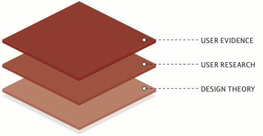
Omawiamy w nim pięć głównych tematów, które klient powinien przedyskutować ze swoim specjalistą od użyteczności:

  1. Jakie metody oceny użyteczności są właściwe dla Twojego projektu?
  2. Według jakich standardów będzie się odbywało badanie i co zostanie ocenione?
  3. Jacy użytkownicy wezmą udział w badaniu?
  4. Czy otrzymane odpowiedzi będą pomocne i dokładne?
  5. Jak przydatny będzie dostarczony raport?

Raport jest adaptacją wytycznych, jakie stworzyli członkowie brytyjskiego oddziału Usability Professionals’ Association. UK UPA oraz UPA zezwoliły nam na jego wykorzystanie, więc przetłumaczyliśmy dokument i zaktualizowaliśmy go, dostosowując jednocześnie do polskich warunków.

Część rekomendacji (m.in. te dotyczące ISO) złagodziliśmy. Parę innych jednak zostawiliśmy, mając świadomość, że jest na nie trochę za wcześnie. Raport ma wytyczać kierunek, a nie tylko sankcjonować to co jest.

Przed publikacją skonfrontowaliśmy raport z zaprzyjaźnionymi specjalistami oraz klientami. Feedback był jednoznaczny – istnieje  potrzeba dostarczenia bardziej zaawansowanej wiedzy dla klientów (i społeczności).
Edukację początkową w dziedzinie użyteczności mamy całkiem niezłą. Konferencje, szkolenia, książki. Dlatego uważamy,że warto więc wyjść poza podstawy, tak aby klient miał świadomość również tych mniej oczywistych aspektów naszych usług.

Linki do pobrania:

I dla porównania: rekomendacje oryginalne w języku angielskim (format PDF).

Na potrzeby raportu uruchomiliśmy odrębną stronę: usability.org.pl, ale poza nim niczego więcej na razie tam nie ma. :-)

Wyrwane z kontekstu – Why focus groups don’t work

The worst way to design a website is to have five smart people in a room drinking lattes. The longer you leave them in the room the worse the design becomes. The next worst way is to have 15 customers in a room drinking lattes. What people say they do and what they actually do are rarely the same thing.

“We hardly ever use focus groups because they just don’t work very well at uncovering user needs,” stated Christine Perfetti when she worked for At User Interface Engineering. “The biggest problem: what users say in a focus group rarely matches what they do in a real-life setting. Users’ opinions about a site or product are very rarely consistent with how they behave when they actually interact with it.”

Źródło: Why focus groups don’t work, Gerry McGovern

Wyrwane z kontekstu – Location-based service users are more often young and mobile

  • 7% of adults who go online with their mobile phone use a location-based service.
  • 8% of online adults ages 18-29 use location-based services, significantly more than online adults in any other age group.
  • 10% of online Hispanics use these services – significantly more than online whites (3%) or online blacks (5%).
  • 6% of online men use a location-based service such as Foursquare or Gowalla, compared with 3%  of online women.

Źródło:  Location-based service users are more often young and mobile, Pew Internet & American Life Project

Wyrwane z kontekstu – How Google tested Google Instant

The team was struck by how few of the outsiders noticed that the search results were changing rapidly below the search bar, Boyd said. People in this testing protocol noticed other changes that Google had recently made–such as the design changes on the left-hand navigation bar that had rolled out several months before most were brought into the testing lab–but less than half of the outsiders noticed Google Instant during the first series of tasks.

As the summer progressed, researchers settled into a weekly pattern. They would test Google employees the first few days, and outsiders later in the week, meeting with the Google Psychic design team when testing was complete to go over the results and suggest changes. One major change that was the direct result of user feedback was the rate at which Google Instant generated new results, which was too fast for early testers of the product.

The end result was what Boyd called “the most positive professional experience of my research career,” with Google Instant rolling out in early September with few glitches or complaints.

Źródło: How Google tested Google Instant, Cnet

PS. To już setny wpis. Dzięki.

User Exprerience w Microsoft – jak oni to robią?

Mniej więcej rok temu, na blogu Microsoftu poświęconego nowej wersji Office, pojawił się wpis o tym jak Microsoft bada z użytkownikami nowego Office’a, we wczesnym stadium produkcji.

We bring people from outside of Microsoft into a small room (a.k.a., the lab) that contains a desk and a PC so they can work with our software. Inside the lab, there are some cameras and a piece of one-way glass so the researcher, the designers, PMs, testers and developers can all monitor whether or not the software being studied is meeting the needs of the user. We conduct these lab studies in order to find problems that affect the usability of our software and we typically do a few thousand hours of these studies for each release of Office.

One of our favorite pieces of equipment to use in the lab is the eye tracker. The eye tracker allows us to see what people are looking at while they are using our software. This is incredibly useful when building new UI like the Ribbon and the Backstage because the mouse pointer doesn’t always tell an accurate story about where people are looking on the screen. Below is an example of output (a heat map on the left and gaze plot on the right) from one of our eye tracking studies conducted on the Backstage view using an early prototype.

clip_image002 clip_image003

The heat map on the left tells us where people spent most of their time looking for something. The longer someone looks at a specific location, or the more times someone’s gaze returns to a specific location, the hotter the color on the heat map. The gaze plot on the right tells us the path the eyes followed to get to a particular location.

The study participants’ goal was to open a recently used file. To complete the task successfully, a participant needed to open a specific file – the third in the Most Recently Used (MRU) list shown in the middle pane (of the 3 panes displayed on the screen). All participants were successful on this task. What we learned from the pictures above, however, was that while people eventually located the correct file, they spent a lot of time searching through the templates section in the right pane before going to the MRU.

Co ciekawe z innej notatki wynika, że Microsoft korzysta w sensowny sposób z prototypowania i szkicowania, a także prowadzi badania terenowe (field studies):

We identify user needs and create compelling experiences in a number of ways. For example, User Experience Researchers work to understand user needs early in the product development cycle using methods such as Field Visits. A field visit is when Researchers visit with users in their own environment and observe how they work with software to get their tasks done. Researchers also utilize methods such as Lab Studies (see image below) where we bring users into controlled lab environments and have them work through real world scenarios. While doing so, we use prototypes as primitive as paper drawings to actual working builds; depending on the phase we are at in the product development cycle.

W powszechnym postrzeganiu Microsoft nadal jest identyfikowany jako ociężała firma, która tworzy niezrozumiałe i trudne w użyciu produkty. Powyższe cytaty dają nadzieję, że kolejne wersje aplikacji wypuszczanych przez firmę z Redmond będą powodowały mniej frustracji i niezadowolenia użytkowników. Oby ;)

Źródła:

Obrazek – Searching for ourselves

Źródło: Managing Your Online Profile: How People Monitor Their Internet Identity and Search for Others Online, PewResearchCenter

Sprzęt – Looxcie – kamera bluetooth

Na rynku pojawiła się jeśli nie pierwsza, to raczej nie ostatnia kamera Bluetooth, która umożliwia nagrywanie “zza ucha” krótkich klipów i prowadzenie rozmów video. Kamera działa cały czas a “Instant Clip” pozwoli Ci zapisać ostatnie 30 sekund przed nagraniem.

Bardzo ciekawi mnie, czy (a raczej jak szybko) zostanie  zastosowana do badań z użytkownikami aplikacji mobilnych. Bardzo ciekawy pomysł z punktu widzenia badania user-experience i raczej wielkie zagrożenie dla ochrony prywatności.

Cena urządzenia wynosi 199 dolarów na Amazon.com.

Magia numerów: 95 znaków wystarczy każdemu?

Nie bardzo wierzę w magię cyfr, prostych rozwiązań i badań dających odpowiedź na wszystkie pytania. Pomimo tego niektóre badania, przeprowadzone ze znamionami doświadczalności, mogą dać próbę odpowiedzi na konkretne pytania, w konkretnym miejscu w czasie.

Do tego typu badań, należy badanie z 2005 rok – “The Effects of Line Length on Reading Online News”, mające dać odpowiedzieć, jaka ilość znaków w linii (na stronie WWW) jest najwłaściwsza.

Reading rates were found to be fastest at 95 cpl (characters per line) . Readers reported either liking or disliking the extreme line lengths (35 cpl, 95 cpl). Those that liked the 35 cpl indicated that the short line length facilitated “faster” reading and was easier because it required less eye movement. Those that liked the 95 cpl stated that they liked having more information on a page at one time. Although some participants reported that they felt like they were reading faster at 35 cpl, this condition actually resulted in the slowest reading speed.

Circulation of newspapers at 814 of America’s largest daily newspapers declined 1.9% from September 2004 to March 2005 (Shin, 2005). This decline is part of a 20-year trend in newspaper circulation and is due, in part, to the increased use of the Internet and other forms of media (cable, satellite, etc). As users continue to choose online news sources, it is imperative to understand factors that contribute to improving the overall online reading experience for news. Participants were able to read news articles significantly faster while maintaining high reading efficiency using 95 cpl. Despite the fact that there were no differences in satisfaction scores, a line length that supports faster reading could impact the overall experience for users of online news sources.

Źródło: Usability News 72 – The Effects of Line Length on Reading Online News

Koncepcja zbadania łatwości zapamiętania nazwy serwisu

Q: We think our client’s proposed name for their application is hard to remember. How do we prove it? Looking for a simple testing protocol or article on same… any suggestions most welcome, thanks!

For detail: their proposed name is both a new verb form based on an adjective (eg “surprisify”) /and/ a spelling variant of what you’d expect the spelling to be (eg “surprizify”) (those aren’t the real words, but it gives you an idea.

A: Try using a five-second test, and put up a mockup/slide of a home page with several bullet points. Take it down after 10-15 seconds. You could even have audio pronouncing the hard to register (and perhaps not phonetically spelled) name.

After the test, ask people what they remember from the site. Then ask them to go to the web site’s address, and watch what they type. As always, reassure them there’s no right answer, and that they aren’t being tested (especially because you’re hoping they will fail).

Źródło: Protocol for testing domain/brand recall, Archiwum IxDA

Obrazek – Validation Stack

Źródło: Winning a User Experience Debate | UX Booth.

Krótko – Testy online: A/B czy wielowymiarowe?

Bardzo przyzwoity tekst: Testy online: A/B czy wielowymiarowe? do przeczytania  na  Conversion blog. Polecam.

Wyrwane z kontekstu – “3 Things Steve Krug Didn’t Tell You About Usability Testing”

Case in point: we redesigned a page where people were stumbling on the UI. In the next batch of tests I asked users to tell me whether they liked the interface on the old page or the new one. The results were astounding: my new page was preferred 95% of the time! Wow, I’d massively improved the main vocabulary page! But wait, why was the number so high? Just for the heck of it, I started switching the pages that were “new” and “old.” Whereas before I’d give the testers variant A and then said “here’s a redesigned version,” and show them B, now I lied and did the opposite. You know what? Suddenly people loved the old page overwhelmingly.

Zrodlo: 3 Things Steve Krug Didn’t Tell You About Usability Testing « A Separate Piece.