Search Results for: magia numerów

Wyrwane z kontekstu & Magia numerów – Simple trumps complete

“Simple trumps complete” – a 5% feature used by less than 5% of all users is a distraction for all the other users, and is better removed, unless its really critical a small number of users do need to cancel service, for example. I have this mental model of particles of attention that a user brings, a finite quantity that they will spread around according to what catches their attention. I call them “attentrons”. An extra tab or button will attract a bunch of attentrons that are not then available to focus on other areas. So the tab had better be better than the competing areas of the site to avoid diluting the results, or its better off removed.

Źródło:  What types of things does Netflix A/B test aside from member sign-up?,  Neil Hunt, Chief Product Officer @ Netflix, Quora
Magia numerów: Trzy kliknięcia i ani jednego więcej

Ostatnio, przeglądając jakąś specyfikację,  po raz kolejny natrafiłem na wymaganie – zwane regułą trzech kliknięć – aby wszystkie akcje w serwisie były możliwe do wykonania w trzech kliknięciach.

Jak każda nierozbudowana, ostatecznie-brzmiąca reguła, w dodatku  z cyfrą – tak i ta dobrze się “sprzedaje”. Nic nietypowego, prawda?

W ciągu kilku ostatnich lat pojawiło się sporo uzasadnionych głosów, które negowały skuteczność tej dobrze rozprzestrzenionej tezy. W polskiej sieci temat analizowały dziewczyny z UXBite, nie ma więc sensu po raz kolejny omawiać tematu. Zainteresowało mnie jednak, jakie jest właściwie jej źródło.

Najbardziej obecnie wiarygodne źródło informacji, czyli Wikipedia wskazuje, że reguła trzech kliknięć jest autorstwa znanej sieciowej osobistości – Jeffreya Zeldmana, który w wydanej w 2001 roku książce Taking Your Talent to the Web napisał:

It’s widely agreed, even by people who are not idiots, that web users are driven by a desire for fast gratification. If they can’t find what they’re looking for within three clicks, they might move on to somebody else’s site.

Hence the so-called “Three-Click Rule,” which, as you might expect, states that users should ideally be able to reach their intended destination within three mouse clicks.

With the average site offering hundreds if not thousands of items and options, the Three-Click Rule sounds preposterous. But it is actually fairly easy to achieve if you start by constructing user scenarios before you begin to design the site.

What will people who use this site want to do? Where will they want to go? Based on those scenarios, the site is structured into main areas of content. These are then organized into no more than five main areas. Submenus in each of the five main areas get the user close enough that he or she is at least reassured by the third click, even if it takes a fourth click to get to the final, desired page.

Reguła trzech kliknięć jest też przypisywana popularnemu specjaliście zajmującemu się użytecznością –  Jakobowi Nielsenowi, który jednak w swojej książce Prioritizing Web Usability pisze:

The three-click rule espoused by some people states that any information on a Web site should be reachable from the homepage in three clicks or less. However, this has never been one of our usability guidelines.

In fact, we found that users’ ability to find products on an e-commerce site increased by 600 percent after the design was changed so that products were four clicks from the homepage instead of three. Even with one more click, the revised design was faster and more manageable because users didn’t have to spend as much time thinking about where to click.

Przeglądając inne źródła i materiały, natrafiłem na artykuł Breaking the Law: The 3 Click Rule w serwisie Grundy Home proponuje zdecydowanie sensowniejsze i bardziej podejście życiowe do tytułowej reguły:

Every click or interaction should take the user closer to their goal while eliminating as much of the non-destination as possible.

Powyższa reguła sformułowana w specyfikacji, mimo że mniej precyzyjna, wydaje się dużo bliższa światowi rzeczywistemu i ma nieporównywalnie większy sens.

Jeśli zdarza wam się pisać czasem specyfikacje lub SIWZy – użyjcie tej mniej oczywistej, ale zdecydowanie bardziej sensownej reguły.

Magia numerów: 95 znaków wystarczy każdemu?

Nie bardzo wierzę w magię cyfr, prostych rozwiązań i badań dających odpowiedź na wszystkie pytania. Pomimo tego niektóre badania, przeprowadzone ze znamionami doświadczalności, mogą dać próbę odpowiedzi na konkretne pytania, w konkretnym miejscu w czasie.

Do tego typu badań, należy badanie z 2005 rok – “The Effects of Line Length on Reading Online News”, mające dać odpowiedzieć, jaka ilość znaków w linii (na stronie WWW) jest najwłaściwsza.

Reading rates were found to be fastest at 95 cpl (characters per line) . Readers reported either liking or disliking the extreme line lengths (35 cpl, 95 cpl). Those that liked the 35 cpl indicated that the short line length facilitated “faster” reading and was easier because it required less eye movement. Those that liked the 95 cpl stated that they liked having more information on a page at one time. Although some participants reported that they felt like they were reading faster at 35 cpl, this condition actually resulted in the slowest reading speed.

Circulation of newspapers at 814 of America’s largest daily newspapers declined 1.9% from September 2004 to March 2005 (Shin, 2005). This decline is part of a 20-year trend in newspaper circulation and is due, in part, to the increased use of the Internet and other forms of media (cable, satellite, etc). As users continue to choose online news sources, it is imperative to understand factors that contribute to improving the overall online reading experience for news. Participants were able to read news articles significantly faster while maintaining high reading efficiency using 95 cpl. Despite the fact that there were no differences in satisfaction scores, a line length that supports faster reading could impact the overall experience for users of online news sources.

Źródło: Usability News 72 – The Effects of Line Length on Reading Online News

Magia numerów: Magiczna Piątka Nielsena

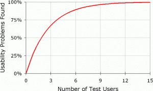
Jednym z bardziej popularnych stwierdzeń w świecie badań użyteczności, poza magicznym siedem plus/minus dwa jest Magiczna Piątka Nielsena. Teza ta zakłada że pięcioro użytkowników testu użyteczności jest w stanie wykryć 85 procent (najbardziej oczywistych?) błędów związanych z użytecznością badanego systemu.

Dyskusja na temat słuszności tej tezy ciągnie się już dobre dziesięć lat i należy do tej samej puli tematów co lokalizacja labelek w formularzach i przydatność eyetrackingu w badanach.

Znakomity przegląd historii tej tezy zaprezentował autor książki Measuring the user experience w artykule A Brief History of the Magic Number 5 in Usability Testing: Measuring Usability Blog. Dobrze udokumentowany tekst. Lektura obowiązkowa.

Metryka na piątek – Współczynnik zagubienia

W ramach jednego z z poprzednich wpisów –  “Magia numerów: Trzy kliknięcia i ani jednego więcej” przywoływałem (postrzeganą i zdiganozowaną jako fałszywą) regułę trzech kliknięć. Analizując historię tej metryki, zacząłem się zastanawiać na inną metodą mierzenia wydajności użytkownika w nawigacji – powiązanego z ilością odwiedzonych stron.

Z pomocą przyszło kilka źródeł i artykułów, z których najciekawszym jest artykuł “Towards a practical measure of hypertext usability” który ukazał się 15 lat temu (!) w znakomitym czasopiśmie Interacting for Computers. Artykuł opisuje w szczegółach badanie grupy 16-17 uczniów,  przeszukujących strony uczelni pod kątem dni otwartych i egzaminów.

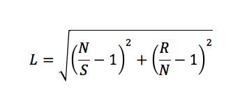
We wspomnianym artykule autorka zaproponowała współczynnik zagubienia na stronie (lostness), określony następującym wzorem:

gdzie:

  • L: współczynnik zagubienia
  • N: liczba różnych stron odwiedzonych podczas wykonywania zadania
  • S: liczba wszystkich stron odwiedzonych podczas wykonywania zadania (wliczając ponowne odwiedziny tych samych stron)
  • R: minimum  stron potrzebnych do wykonania zadania

Przeprowadzone przez Pauline A. Smith badania wykazały, że wartością graniczną, dla której zaczyna się powyżej której pojawia się u badanych uczucie zagubienia, jest wartość 0,42. Aby jednak nie traktować tego wskaźnika, jako kolejnego z serii  “magicznych numerów”, autorka dodaje:


It is not suggested that any of the measures proposed are definitive, rather that they could provide assistance for the implementors of hypertext systems in allowing them to practically and quickly identify and focus on areas of their information base where the users are exhibiting dysfunctional behaviour. It is suggested that they could be more useful for this purpose than the more traditional measures of tune taken to complete a task and the number of errors.

Warto też dodać, że samego współczynnika zagubienia nie można korelować z satysfakcją użytkownika (lub jej brakiem) bez przeprowadzenia i obserwowania dodatkowych wskaźników.

Bibliografia dla zainteresowanych: