Wyrwane z kontekstu – User-friendly locations of error messages in web forms

Niekończąca się dyskusja:

In this study important insights were achieved, showing that error messages near the erroneous input field lead to the best performance. Among these error messages, the error message on the right side was evaluated as the most satisfying and expected.

The practical implications of the current findings are clear. Comparing these results to the findings of the web conventions study, error messages are currently often implemented in suboptimal ways. Only few online shops display the error message on the right side of the erroneous field (6.7% overall). In most instances the error messages do not even appear directly near the erroneous input field (71.5% overall), but on the top of the entire form (45.5% over- all).

In the best case this leads to lower ordering speed and customer satisfaction, in the worst case users are not able to complete the ordering process.Many online shops, small shops as well as the world’s leading shops, could therefore benefit from an improvement in the placement of error messages.

Źródło: User-friendly locations of error messages in web forms: Put them on the right side of the erroneous input field, Mirjam Seckler, Alexandre N. Tuch, Klaus Opwis, Javier A. Bargas-Avila, Interacting with Computers 24 (2012) 107–118

Wyrwane z kontekstu – The rise and fail of the Guardian Facebook app

I’ve observed a lot of user testing sessions where people are very nervous about clicking any kind of Facebook sign-in or integration button, expressing concern that they don’t know what it will do, and don’t want everybody to know everything that they are reading.

This must be a worry for Facebook, although it isn’t by any means universal. Only yesterday I observed a session where a woman explained that she was more than happy to share whatever news she was reading. “There is no secret in reading the newspaper. It isn’t porn” she said. But the longer legacy of “frictionless sharing” might not be lots of rows logged in a database somewhere, but an impact on the willingness of users to activate features that involve Facebook.

Źródło: The rise and #fail of the Guardian Facebook app, Martin Belam, Currybetdotnet

Wyrwane z kontekstu – Intranet Users Stuck at Low Productivity

A to akurat słuszna obserwacja Jakoba Nielsena:

A second reason intranet usability has not kept up with intranet features is the increasing reliance on out-of-the-box design from packaged intranet solutions. Having studied the winners of many years’ Intranet Design Annuals, it’s clear that great intranet design requires companies to modify packaged solutions to suit their specific needs.

The default user interface will do you no good. Although it’s nice to use packaged software instead of coding everything yourself, the user experience remains your responsibility, and you must design a user interface that goes beyond the default settings.

Źródło: Intranet Users Stuck at Low Productivity, Jakob Nielsen, Jakob Nielsen’s Alertbox

Wyrwane z kontekstu – What is the best process for simplifying a user interface and experience?

Bardzo dobre (chociaż miejscami bardzo oczywiste) podsumowanie  Dana Saffera, autora bardzo popularnej książki Designing for interactions, zawierające rekomendacje jak najlepiej upraszczać interfejsy i doświadczenia:

  • Remove features. The more features you have, the more complexity you have.
  • Hide features. Use menus, tabs, dropdowns, etc. to make features available, but not seen until needed.
  • Organize features. Cluster like features, content, and controls together under a single area (which can be hidden).
  • Tightly align the user’s mental model with the product’s conceptual model. The closer you get, the simpler it will seem.
  • Make every choice visible. Rather than hiding all choices under a dropdown, for instance, show them all.
  • Conversely, hide some choices if there are too many to be reasonably scanned.
  • Reduce choice. Take away customization and limit choices to the most often used.
  • Smart defaults. Have them. Make them visible.
  • Shortcuts. Make shortcuts to the most used actions in the product.
  • Distribute functionality to the right platform. Decide where functionality should logically be located: device, desktop, web. Don’t cram everything onto one platform unless it makes sense to do so.

Źródło: Product Design (software): What is the best process for simplifying a user interface and experience?, Dan Saffer, Quora

Wyrwane z kontekstu – How to simulate context of use in-lab

If you have a product or service where context of use directly impacts on the user experience, consider these top tips when simulating context of use in the lab:

  • Let users experience the whole experience – Don’t force users down one single path. Instead allow users to explore the entirety of a system or site, even if parts are less developed
  • Consider physical factors – think about the physical set up e.g. the height, distance, angle and physical restrictions of the device/interface that will be used
  • Consider sensory factors which may distract the user from the task at hand and think about which of these can be brought into the lab
  • Consider factors which may normally enhance an experience – for example offer drinks and snacks when testing something designed to be used by a group of friends on a Friday night.

Źródło How to simulate context of use in-lab, Nicole Harlow, Foolproof

Wyrwane z kontekstu – The benefits of digital by default

Digital by default services are more efficient and more convenient for users. Our initial testing comparing GOV.UK to the previous Directgov and Businesslink.gov.uk sites shows a more positive rating on both ease of use (93% compared with 75% before) and speed (80 seconds as opposed to 120 seconds to undertake comparable transactions).

Government will save money if demand for higher cost channels decreases. A 2012 SOCITM study across 120 local councils estimated that the cost of contact for face to face transactions averages £8.62, for phone £2.83, but for web only 15 pence. The Digital Efficiency Report found that the average cost of a central government digital transaction can be almost 20 times lower than the cost of telephone and 50 times lower than face to face.

Źródło: Government Digital Strategy, praca zbiorowa, UK Cabinet Office

Wyrwane z kontekstu – How data analysis helped Obama win

The campaign rigorously tested donation-related words such as Donate Now, Please Donate, Why Donate, Donate and Get A Gift, Contribute. They found that “Why Donate” was by far the poorest performing phrase. “Donate And Get A Gift” worked best for those who had not yet signed up for the campaign. “Please Donate” worked best for those who had already signed up. “Contribute” worked best for those who had signed up and already made at least one financial donation.

If the 2008 campaign was rigorous, the 2012 campaign was scientific. As one official told TIME magazine, the era of “guys sitting in a back room smoking cigars, saying ‘We always buy 60 Minutes’” is over.” As TIME summarized, “In politics, the era of big data has arrived.” If the worst way to try to win a political campaign is to have five smart people in a room smoking cigars and pontificating, then the worst way to manage an online presence if to have five smart people in a room drinking lattes and opinionating.

“We are going to measure every single thing in this campaign,” campaign manager Jim Messina said after taking the job. According to TIME, “He hired an analytics department five times as large as that of the 2008 operation, with an official “chief scientist” for the Chicago headquarters named Rayid Ghani, who in a previous life crunched huge data sets to, among other things, maximize the efficiency of supermarket sales promotions.”

 Źródło: How data analysis helped Obama win, Gerry McGovern,  New Thinking

Wyrwane z kontekstu – Audience and Disclosure Regulation in Online Social Network Sites

We found that students who were worried about privacy were less likely to start using social network sites. Once the students did make the jump, they managed their concerns about unwanted audiences by adjusting their usage of nicknames on Myspace and through adjusting the visibility of their profiles on Facebook and Myspace but not by regulating their levels of disclosure, except for the case of phone numbers.

We also found that the perceived likelihood that future employers, government, corporations, or romantic partners would see their profile did not have an impact on the visibility of their profiles. The students also did not find any of those scenarios very likely, except for future romantic partners. (A possible romantic partner looking at the profile, rather than being a cause for concern,may actually be an aim for many of the students.)

Źródło: Can You See Me Now? Audience and Disclosure Regulation in Online Social Network Sites, Zeynep Tufekci, University of Maryland, Baltimore County

Czym jest użyteczność? – Sonda uliczna

Organizatorzy WUD Silesia przeprowadzili bardzo interesującą sondę uliczną, zadając pytanie: “Czym jest użyteczność?”.  Polecam (czas trwania: 1 minuta 20 sekund).

Wyrwane z kontekstu – Lean UX is Nothing New

Ultimately it doesn’t matter whether Lean UX is something new or a tried-and-true methodology that’s been practices for years. Even less important is what name you or your organization give it. As long as you’re working in this collaborative, iterative fashion you are approaching validated designs in a much more efficient way and no one is going to criticize you for not “doing” Lean UX or Agile or Agile Fall or whatever you call your process.

Źródło: Lean UX is Nothing New, Jeff Gothelf, Johnny Holland

Przy okazji: O’Reilly wydaje książkę Lean UX: Getting Out of the Deliverables Business, której autorem jest właściciel powyższego cytatu.

Wyrwane z kontekstu – Golden Rules of User Interface Design

Przeglądam ostatnimi czasy sporo tekstów, artykułów i książek poświęconych projektowaniu user experience i nie czuję, aby niosły one jakąś wielką wartość. Mam wręcz rażenie że im starsza ksiązka, tym mniej bełkotu się tam znajdzie. Przechodząc do meritum: Theo Mandel, autor The Elements of User Interface Design opublikowanej w roku 1997, udostępnił piąty rozdział wspomnianej książki Golden Rules of User Interface DesignGorąco polecam, bo treść niewiele się zestarzała. Poniżej podsumowanie.


Mandel’s Golden Rules

The golden rules are divided into three groups:

  1. Place Users in Control
  2. Reduce Users’ Memory Load
  3. Make the Interface Consistent

Each of these groups contains a number of specific rules. The rules (and a keyword for each rule) for each group are:

Place Users in Control

  1. Use modes judiciously (modeless)
  2. Allow users to use either the keyboard or mouse (flexible)
  3. Allow users to change focus (interruptible)
  4. Display descriptive messages and text(Helpful)
  5. Provide immediate and reversible actions, and feedback (forgiving)
  6. Provide meaningful paths and exits (navigable)
  7. Accommodate users with different skill levels (accessible)
  8. Make the user interface transparent (facilitative)
  9. Allow users to customize the interface (preferences)
  10. Allow users to directly manipulate interface objects (interactive)

Reduce Users’ Memory Load

  1. Relieve short-term memory (remember)
  2. Rely on recognition, not recall (recognition)
  3. Provide visual cues (inform)
  4. Provide defaults, undo, and redo (forgiving)
  5. Provide interface shortcuts (frequency)
  6. Promote an object-action syntax (intuitive)
  7. Use real-world metaphors (transfer)
  8. User progressive disclosure (context)
  9. Promote visual clarity (organize)

Make the Interface Consistent

  1. Sustain the context of users’ tasks (continuity)
  2. Maintain consistency within and across products (experience)
  3. Keep interaction results the same (expectations)
  4. Provide aesthetic appeal and integrity (attitude)
  5. Encourage exploration (predictable)

Źródło: Golden Rules of User Interface Design, Theo Mandel, The Elements of User Interface Design, Wiley 1997

Wyrwane z kontekstu – PICTIVE

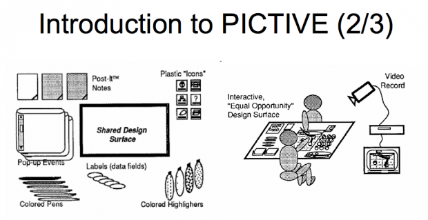
PICTIVE  to skrót od  Plastic interface for Collaborative Technology Initiatives through video exploration. Interesująca metoda wspólnego projektowania (participative design) opierająca się na wykorzystaniu prostych, podstawowych elementów wyposażenia biurowego, do projektowania interfejsów – bez wykorzystania technologii (za wyjątkiem kamery).

The PICTIVE object model consists of  common office objects, such as colored  pens and Post-It™ notes, as well as scissors and removable tape for tailoring  those materials. These low-tech objects are intended to be mapped onto com- puter functionality, usually as user interface objects. The materials may be supplemented with customized objects, such as proposed icons, or paper repre sentatlons of components of a windowing environment.

Zapoczątkowana metoda pochodzi z początku lat 90-tych (!) kiedy  użyteczność ciągle nazywana była human factors, graficzne środowiska wyglądały dramatycznie źle, a większość czytelników tego serwisu (włącznie z autorem) odbywała edukację w szkole podstawowej.

Under the PICTIVE process model,  these low-tech objects are used by all participants to express their ideas to one another. Each participant is responsible for explaining her or his personal and/or professional stake on the design, and for explaining her or his special expertise.  This may take the form of a mini-tutorial, or a demonstration of a prototype that  was developed following earlier sessions.

Usually guided by the users’ narrative of  their task flow, the group then uses the  low-tech objects to brainstorm ways of adapting technology to the users’ work process; these discussions may also lead to changes in the work process itself, with or without technology interventions. Often, diverse domains and perspectives are communicated through the concrete, low-tech artifacts. Each session concludes with a short design walk-through, captured on video. This helps to focus the group’s achievements, building mutual commitment and collective competence. It also provides a video “minutes of the meeting” that can communicate the group’s design to developers or to other groups (e.g., when multiple stakeholder groups are geographically separated).

The PICTIVE participation model contains three convergent guidelines for deciding who participates in a PICTIVE session. First, diverse expertise contributes unique knowledge to the design. Second, all phases of the software life cycle are likely to be facilitated by the enfranchisement and co-ownership of people who are “downstream” from the design process. Third, we follow the democratic concept that people whose work lives will be influenced by a design should participate In decisions about that design adapted for our North American corporate culture.

Źródła: